

It's not like shocking as a shock per se, but more of an epiphanic shock. These artists use predominantly pink Pantones to address current and controversial themes, or simply to convey messages that make us think, while at the same time excelling on the “cotton candy” aesthetic front.
It's not like shocking as a shock per se, but more of an epiphanic shock. These artists use predominantly pink Pantones to address current and controversial themes, or simply to convey messages that make us think, while at the same time excelling on the “cotton candy” aesthetic front.
Maria Imaginário
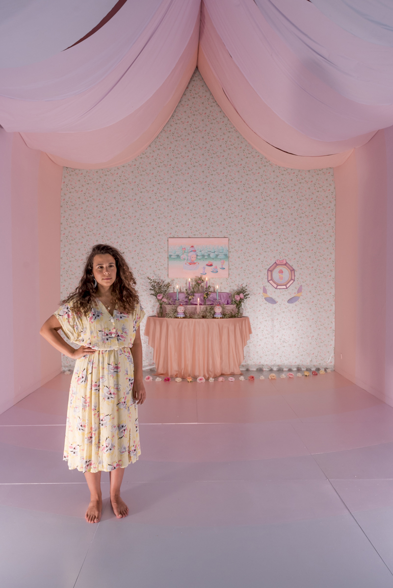
Reducing her work to pink is not seeing the spectrum of pastel shades that paint the imagery of Portuguese Maria's work, but pink is a good starting point to describe a body of artistic works that excel in that feeling. But it is not because they are as fluffy as cotton candy that these figures with eyes and smiles from ear to ear talk less about serious things or are limited to sculptures taken from a fairy tale. Boobies and penises and hearts and emojis and ice creams populate her work in the same way to address issues such as love (and lack thereof), and women and emotions and life and everyday life ... in a way which at first glance may seem naive, but which is sculpted by deeper layers full of humor, irony and a bit of bitterness when mixed in the sweet aesthetic of @ maria_imaginario.
Pink has a strong presence in your body of work. Why pink and what does this color mean to you?
Harmony! Pink is a color that conveys harmony to me. All colors have the power to create memories and feelings, for example, we all have at least one favorite color, right? Color has the power to create emotional responses, whether positive or negative. Color accompanies us all our lives, everything is color.
How did your love affair with pink start?
I don't remember how it started, because I think there was no specific moment, the use of pink did not happen as a conscious choice, it was something more intuitive. Pink and its derivatives, be it the coldest lilac or the warmest salmon, are colors that have always been part of my color palette, ever since I remember painting.
Even if you use other shades, it is worth saying that your art is made of "pink", or that at least it indicates a pink world, making pink a special tone. Why, as an artist, did you choose such a smiling and "good vibes" color and philosophy?
I definitely want to always send good vibes with my work. Even when I talk about less good things, I always use the power of color to balance the emotional side of my work and always leave on a positive note. I want the public to have a feeling of well-being, feel good, looking at my work, this is mainly what makes me happy to create.
Just because it is a type of color that gives rise to the "good vibes" mood, it does not mean that there is no serious message behind it (quite the opposite, as you can see). Do you think that when the message is delivered with a "smile", people tend to accept it more easily?
Yes, I think that everything that is positive is embedded more easily than something that is heavy and negative. My work goes from me to others, leaves me, so passing on a message with a positive emotional impact is something important, I want it to be an escape from our daily lives. I speak of important topics for me, of course, but I think they are a common substance for everyone: love, the duality of feelings, the various phases of emotions, but the color changes the tone of how I pass my stories. I think that one of the good parts of art is getting the color and tone of a piece to elevate the mood of a piece wherever you want, like the soundtrack in a film.
Is it difficult to live in a pink world when the outside world seems to be increasingly gray?
Is the world grayer? Seeing a grayer world is a choice; I, for example, am colorblind to gray and boring tones - most days - I do not own a black piece of clothing, for example. But it is not that I’m in denial, there are dark and gray tones, and it is an important tone for many people. I believe that it is important to know how to live with the gray side too, so that later we can appreciate the lightness and harmony that pink can bring.
Are there any pink cartoon characters you love?
It's funny, I never thought about pink characters before, but suddenly I love Dragon Ball's BUBU. Maybe because I'm always hungry.
What is your favorite pink Pantone?
As a rule, I don't work with Pantones, my pinks are created intuitively in the palette, with a lot of white in the mix, be it for more warm or cold tones. But if I had to choose a Pantone it might be the Aurora Pink, because it is a very neutral pink that I can use in every work.
From your portfolio, what is your favorite pink work?
My installation on Marie Antoinette, at Travessa da Ermida in 2018. My goal was mostly only with color to completely transform a space, and make it an immersive experience, to take you mentally to another place, idyllic and magical, I think I got that.
If you were ever told that the pink color was out of stock, what color would you use?
The blue of the sky on a summer day, or the lilac of a rosewood in May.
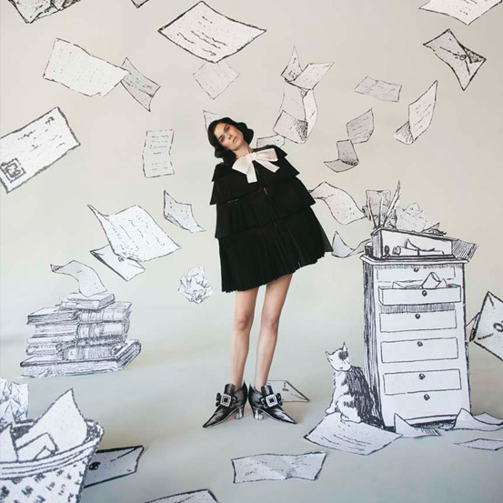
Alberto Pazzi

© Kevin W. Condon
© Kevin W. Condon
The background may be pink, but very little in his illustrations and collages is, metaphorically speaking. In a representation of taboo themes in a somewhat surrealist format that leave room for interpretation, but with no room for doubt about a message that is meant to be serious, Mexican Alberto Pazzi - @ppaazzzzii on Instagram - addresses everything, from his relationship with New York (where he resides) the emotions with which we so easily identify, such as melancholy, loneliness, love, or self-esteem. The vibrant palette does not mask, make no mistake, on the contrary: it highlights even more the lines that draw the most profound human reality, which is not painted happy pink. But the background of Pazzi's works, which have the human figure (namely the female) as the protagonist, is painted as yet another unifying element in a portfolio that needs no explanation: it is the human mind, black on pink. Or cutouts on pink.
Pink has a strong presence in your body of work. Why pink and what does color mean to you?
It's a color that I like to see and use a lot because it goes well with my lines and my painting style. I grew up near a very colorful city in Mexico, where the houses are of all kinds of different colors, which definitely influenced me.
How did your love affair with pink start?
About four years ago, I was drawing abstract shapes with a worn marker on a cheap sheet of pink paper, just as a sketch exercise. These shapes eventually turn into female bodies and random ideas. The fact that these sketches were not on a sheet of plain white paper made them look like finished conceptual pieces and I was happy with them, so I continued and I have only been using pink paper ever since.
Even if you use other shades, it is worth saying that your art is made of "pink", or that at least it indicates a pink world, making pink a special tone. Why, as an artist, did you choose such a smiling and "good vibes" color and philosophy?
I am always looking for meaning, beauty, and to reveal the complexities of human nature in a simple way. Pink is just the color I'm obsessed with and it fits my style better, but I don't think my work is always necessarily "smiling and with good vibes." The message behind it tends to be quite bleak at times.
Just because it is a type of color that gives rise to the "good vibes" mood, it does not mean that there is no serious message behind it (quite the opposite, as you can see). Do you think that when the message is delivered with a "smile", people tend to accept it more easily?
Certainly, the type of work I do is always in search of connection and I feel very satisfied when one of my pieces resonates with the public. Knowing that my work hangs in people's homes and that they bought it because it touched them somehow, fills me with joy and is something I will never take for granted.
Is it difficult to live in a pink world when the outside world seems to be increasingly gray?
You cannot let the outside world paralyze you and prevent you from creating. Your role as an artist is to embrace what you are going through and use that. Whether it is pain or anger, you must have a calm and serene mind to focus on doing sincere and meaningful work.
Are there any pink cartoon characters you love?
The Pink Panther definitely made an impact. There was something about the style of illustration and the soundtrack that looked, above all, like what I was watching at the time.
What is your favorite pink Pantone?
Salmon pink, I don't know the official name, but I hope one day to have a Pantone with my name on it.
From your portfolio, what is your favorite pink work?
It is impossible to choose just one, but the lonely ghost in the bar and the clown who looks in the mirror are definitely among my favorite self-portraits. Both paintings are in the homes of two of my dearest friends, so they are in good hands.
If you were ever told that the pink color was out of stock, what color would you use?
I don't know, probably red. I am sure that I would find a new way of expression that is vibrant and exciting.
Cécile Hoodie
Do not be fooled by the pink tones that seem to dominate the work of Cécile Hoodie: the French artist addresses serious themes in a series of images that seem to drink from the sweet and dark side of a Suicidal Virgos, by Sofia Coppola. To follow her on Instagram, @cecile_hoodie, is to enter a world that vibrates in color, at first glance, but that resonates with serious themes, such as sex, love, feminism, social networks, menstruation, hatred, sexual abuse, gender inequality... In an approach that mixes pop and trashy, there is rebellion as much as aesthetics; there is honesty as much as subliminal, there is as much humor as there is drama. Because here, there are no filters to talk about what matters. Not even in shades of pink.
Pink has a strong presence in your body of work. Why pink and what does color mean to you?
In France, we have the expression “madeleine de Proust”, which designates something that reminds people of their childhood, as well as the smell of madeleines, which made Marcel Proust mention it in one of the volumes of his book In Search of Lost Time. And I would say that pink is one of my many Proust's madeleines, it reminds me of my childhood, the toys and objects I had during the 80s and 90s.
How did your love affair with pink start?
Despite relating this color to my childhood, I don't remember loving pink at that time. It was a color in my life, but during my teenage years, for example, I didn't care about that and thought it was too "feminine" and "princess" for a rebel like me. I was interested in pink, in fact, since I started exploring it in my photos.
Even if you use other shades, it is worth saying that your art is made of "pink", or that at least it indicates a pink world, making pink a special tone. Why, as an artist, did you choose such a smiling and "good vibes" color and philosophy?
Because now, for me, it really is the best color in life. It brings images and objects in a positive way, like a pink blush on the cheeks. I also think pink is very aesthetic. It's warm and fun. I like its kitsch side when it is explored to the extreme and its retro 90s side too. This is the color that is often equated with the feminine (although the colors should not have a gender), childish, candid, festive or kawaii. It is the color of cherry blossoms, doll clothes. I love the aesthetic universes of Sofia Coppola and Wes Anderson, for example, and it is a color that is enough in itself to create an atmosphere and a world that recalls sweetness and the past, something that is well illustrated in the film The Grand Budapest Hotel.
Just because it is a type of color that gives rise to the "good vibes" mood, it does not mean that there is no serious message behind it (quite the opposite, as you can see). Do you think that when the message is delivered with a "smile", people tend to accept it more easily?
Yes, it is something that plays an important role when it comes to my choice of color, the difference between the aesthetic aspect that of the photo, and the message that comes up when you pay a little more attention. I like the idea of producing a childish candy pink image that draws attention and seems innocent, with a stronger message, about serious themes (feminism, LGBTQ+ rights, social injustices ...) or just a fun and tacky meaning. It is a bit of candy pink art, but an acidic candy that can make some people shudder.
Is it difficult to live in a pink world when the outside world seems to be increasingly gray?
No, I find it very encouraging to do it even more. If things around you seem dark and gloomy, this is yet another motivation to take refuge in a world that we choose, that we love and that reassures us. For example, my room doesn’t look like a standard room for a 37-year-old woman, the walls are pink, the curtains too, there are details that look like a teenager’s room from the past, there are fake flowers, images of icons from my youth, and for me it's probably the place where I feel at my very best. This is my “lair”, and recent events and lockdown have only increased my need to feel really good there. I think it is very important not to worry about what people might think about it, when it comes to something that makes us feel good.
Are there any pink cartoon characters you love?
Patrick from SpongeBob SquarePants. I always loved this animated drawing. Patrick is simple, gentle, funny and a faithful friend, and his life, in shorts, makes me dream. Their duet with Bob is perfect, and I think they're super fun. It is a cartoon that is one of the things that reminds me of a time when everything seemed simpler.
What is your favorite pink Pantone?
The Pantone 14-1911 Candy Pink. On the light and soft pink side, like the plastic of my childhood toys. I think this pink is vintage and timeless at the same time. It is the type of pink that I use in many of my photos.
From your portfolio, what is your favorite pink work?
I don't have a favorite photo, actually, but the one with the hamburger paper mask is one of the first ones that was actually shared on large Instagram accounts. I had the idea while eating at a fast food restaurant with my friends. Often, ideas come up when I see objects. And I am very proud to have had this idea, which is quite simple, after all, but which summarizes some things about our eating habits that contradict our self-care routines, for example, and, overall, the paradox of many things in western countries.
If you were ever told that the pink color was out of stock, what color would you use?
It is a good question, because I have no color that competes with the pink in my heart. I imagine it would be a light blue, like the blue of a summer sky, which I also use regularly in my photos (also to switch colors and to make the Instagram feed look better). It is a color that can also refer to childish and sweet things. But it remains cold and, even aesthetically, the objects always stand out better in pink (from my point of view).
Translated from the original on the "Pink Issue", from may 2021.Full credits and story on the print version.
Most popular
.jpg)
Lavar o cabelo noutra cidade: 4 recomendações para não sentir a diferença da água
17 Jun 2026
Relacionados
.jpg)
.jpg)