

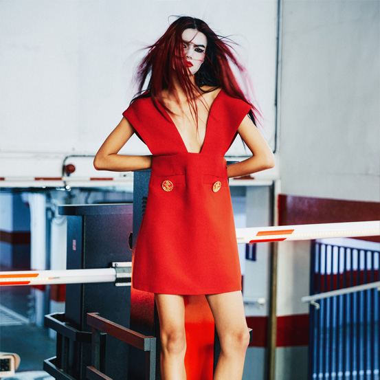
The original quote suggested the use of red, but according to Gracinha Viterbo, interior designer, pink is an increasingly sought-after color in the decoration. And it can be as provocative, and sexy, as old man rouge.
The original quote suggested the use of red, but according to Gracinha Viterbo, interior designer, pink is an increasingly sought-after color in the decoration. And it can be as provocative, and sexy, as old man rouge.
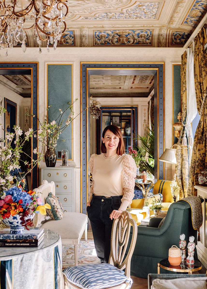
“I'm very chameleonic, I've been called schizophrenic in terms of style. I don't think I am, I think I interpret lives across spaces and, almost like an actress who takes on different roles in different films, I assume I do that in my projects. That said, I can wear a punk pink color and completely shocking and then I can use nude or blush. It depends on the project, it depends on the space, I am very inclusive. In life, with people, and with colors. I never say never to a color.” Gracinha Viterbo, responsible for Viterbo Interior Design, one of the most important design and interior decoration workshops made in Portugal, and herself, one of the most relevant names in the international design panorama, breathes energy and creativity. In an issue dedicated to pink, it would be unthinkable not to speak to someone who, over the past 20 years, has been highly eclectic in the use of colors, patterns and textures, without ever fearing risks or criticism. Graduated at UAL University of Arts London, with two courses, at the Central Saint Martins College of Art and Design and at Chelsea College of Art and Design, she went to Her Majesty's land, where she lived for several years, which refined her taste, eclectic, refined, intrinsically “Gracinha”, which culminated with the opening of her Cabinet of Curiosities store, in Estoril. What does this have to do with pink? Everything. Viterbo, a free spirit, tireless conversationalist, mother of four, sees no limits when it comes to decoration. Hence her passion for color. “I think that the color pink, just like it does with people - it is said that it gives a 'bonne mine', gives a healthy air - sometimes spaces, for example, are the same. A pink sofa can be surprisingly provocative, because it is an innocent color, it is a non-color, it is not a true color, it is made of other colors, and it can take on a series of very interesting shades, both in the background and in a piece, to stand out or dramatize a corner. I use it both in monochromatic rooms, where there are several shades of pink, which create depth, as well as to stand out in a special piece of interior. What happens is that there are clients who still have that prejudice 'pink is for girls', but then it ends up changing, an evolution in the perception of color, depending on my explanation of how I want to insert it in an adult environment.”
Prejudice in the 21st century? Yes. “In the 1980s there was a lot of pink in interior design, at that time Miami Vice-like. There is a classic side that I think is more consistent in terms of pink, which enters the more feminine side, in closets, and you will find wallpapers of more classic brands, with a greater consistency in tone, other times it’s more because it’s fashionable, and then it comes and goes, at the trend level. But I think that the trendiest shades of pink lately are blush and nude. People assume, precisely because of such prejudice, that they are not pink, and are less afraid. If you hear the word ‘pink’ you’re almost standing back, and so sometimes I ‘change’ the color names, with my clients, and it’s completely different. 'This sofa is not pink, it is nude', and it changes everything. When a customer tells me that he does not like pink, green or blue, I can have the mission of showing that he does, he does not like this or that shade, and from there we will look for the shade of that he likes in that color.” Being an interior designer is also, in a way, being a psychologist, knowing how to listen, anticipating the wishes of others. This is something that involves other areas besides aesthetics, and that are of great interest to Gracinha. “What the pandemic came to do was [create awareness], because people didn't have time, they cared much more about the image, about what they took outside, where they were going, there was not much of this introspection. It was not a recurring thing, but that changed. People look at their house as an identity card. I have been struggling for the past 20 years to get people to understand that it starts there. It is from the inside out, sometimes people are not well and it is because the house does not reflect who they are, and that is the basis of my professional mission, it is the mental and connection side of the person with the house, the side of healing [of the person] feeling with his feet on the ground, with roots. We evolve and our homes should evolve with us and that is what is happening. [...] People are more aesthetically demanding and observant, and are more open minded, we are in a phase of great change. People no longer want an opinion 'because they do', they are able to digest color in another way, to include it, things are changing. So the perception of colors is also changing, and the inclusion of them too. I see people more open to different suggestions because they are in need of change. It’s almost like they’re saying ‘give me what I can’t imagine’.”
Enters pink. “Pink, today, is a color that has gained its own personality and that can be used with several facets: more provocative, more classic, inserted to dramatize, to give depth, to give more natural light - there are those use it to give that sunset light, which looks pink. I think that, even in lighting, when we look at lamps and shades of light, when we insert a little pink we end up creating a completely different environment in space. So it is not only in the materials, in the objects, it is also in the light that we see, more and more, the pink color appear, not only the light and the nude but also the shocking. There are now spectacular lights that have a color therapy effect, are called halo and are like sculptures, spots that make pink halos that are placed at the end of the corridor, for example, and have properties almost therapeutic. We are entering the progressive and therapeutic side of design, it is not only sustainable, it is to see how design activates our mental health, and pink is one of the colors used a lot in this new interior design dialogue, which is something that interests me a lot.” And what is the trick to use pink? “There is no universal trick, each house is a house, each client is a client, and one thing I learned from working around the world is that the perception of color changes [from country to country]. When I worked in Africa, and then in Asia, I learned to look at colors with a completely different perception, because I started to understand that the color I saw, depending on where I was in the world, was not exactly like someone else, in someone else’s culture, saw that same color. It is very interesting. This is to say that there is not a single rule, there are thousands of tricks. If you paint a pink ceiling - and I intervene a lot on the ceilings, I don't like only white ceilings - sometimes it is much healthier for the eyes, because the chromatic side influences everything, headaches, at a physical level... And sometimes it is better to have a ceiling several shades above what we have on the wall than just white. A very light pink ceiling, depending on what is underneath, or in nude, or even pinkish-white, it doesn't even need to be pink, it influences the colors and the hue of the house a lot.” Ceiling, okay. But then what? What shades match pink?
Virtually every shade. “Olive, for example, is very beautiful, that very light green, the blue, which is a complementary color, black, is spectacular with very very light pink, black, white and pink is the best ... I like it to see carrots with a slightly stronger pink, beige, coffee with milk, taupe ... I can use pink in many combinations. And I really like pink sofas. I think a pink sofa brings a certain provocation, even if the room is for a man, it doesn't have to be a feminine thing, pink has to be normalized. And then pink can be in an unexpected room, almost like a disruptive element that makes everything else work. There are several cases of rooms with pink sofas in which what makes the room is the sofa. I don't like things to match very much, unless we are playing with a monochrome palette.” Hence our interest in wallpapers. Are they a good solution, or are they completely out? "I am an apologist for wallpapers, I think there is still a huge taboo, I have clients who say to me 'Ah, it reminds me of my grandmother's house, I don't want to do it', but then when the person sees it done, she loves it. [...] When it is a busy wallpaper people are afraid to cover the whole room and I sometimes convince them to do so and, in the end, they realize that they are in another environment. It is empowering. It is taking a risk. And I see that people who take that risk never regret it. And in pink, yes. It is a color that can be provocative, it can be calm, it can be safe, depending on how it is used. The beautiful thing about this color is that it’s very transversal.” All in all, according to Gracinha Viterbo: “We got it into our heads that pink was a well-behaved color and it appears as a provocative color, and this is a game that is interesting. The pink color is almost elastic, it can be used in several ways, depending on the material. [...] Because pink is a game, it is a teaser. As it has associated with it the story of being a well-behaved, calm color, linked with the feminine, it can enter as a teaser for a more rebellious and humorous side. There are colors that surprise, and pink is one of them.” None of this is small talk. “Pink was the color of my wedding. It was the theme of my wedding party. It is part of my life. And part of good memories too.”
Translated from the original on the "Pink Issue", from may 2021.Full credits and story on the print version.
Most popular
.jpg)
Lavar o cabelo noutra cidade: 4 recomendações para não sentir a diferença da água
17 Jun 2026
Relacionados
.jpg)