

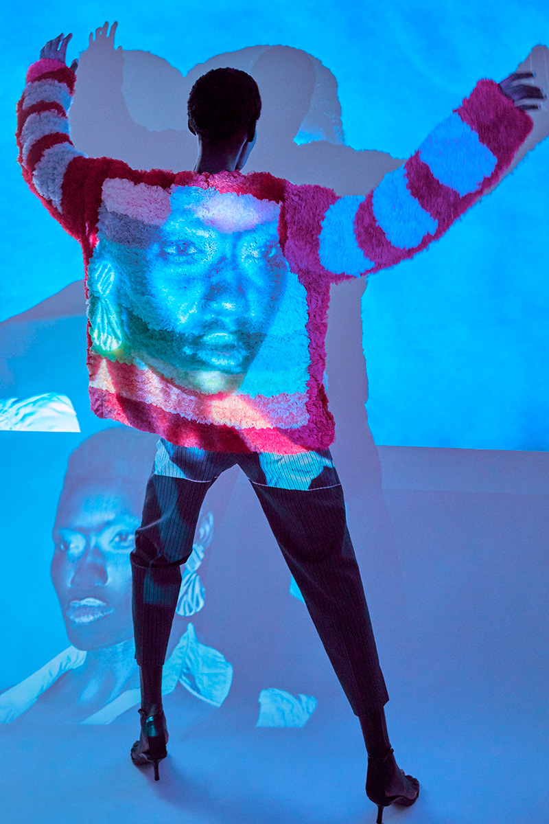
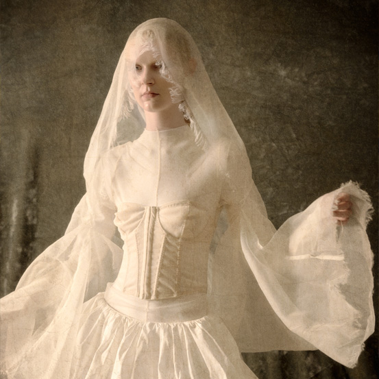
And the secondary ones after that: from the pure color that is blue, next to its red and yellow pairings, comes the full spectrum that paints the following pages.
And the secondary ones after that: from the pure color that is blue, next to its red and yellow pairings, comes the full spectrum that paints the following pages. In a chromatic degradé that explores the rainbow of a planet that could never disregard the blue after which it is named, it is in the light where the best combinations occur. A part of the addictive triad that makes for RGB – red, green & blue -, and that brings us white, as much as its subtractive shares like magenta (red + blue), yellow (red + green) and cyan (green + blue), whose mixture brings us black, it’s in its projection that we can better tell the stories reflected on our skin, walls and closets. Like a technicolor film in a sequence of movie stills. Photography by Nuri Garre. Styling by Alex Montoya.
Originally published on Vogue Portugal October 2020 issue, Into The Blue.
Most popular
Portugal Fashion Experience 2026: os 4 nomes a ter em conta nesta edição
07 Jul 2026
.jpg)
As celebridades que marcaram presença no casamento de Taylor Swift e Travis Kelce
06 Jul 2026
All articles
Relacionados
.jpg)
Da página ao portal: como melhorar um ritual de leitura, independentemente do cenário
13 Jul 2026
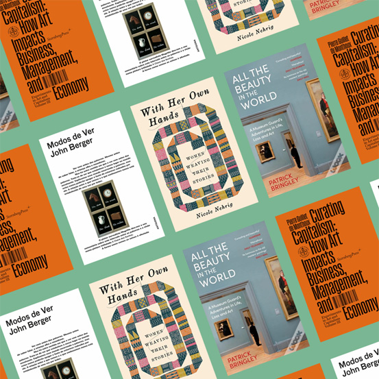
8 livros (de tudo menos Moda) para expandir e transformar a forma como se pensa em Moda
10 Jul 2026