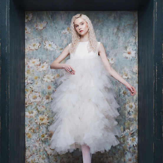
It is not enough to touch on the tones or the nobility of the materials. It is not enough to have an excellent production, or even to dare when combining white and yellow gold with the pink that dictates the mood of this issue. It is necessary to know how to put everything together under one motto: that of design.
It is not enough to touch on the tones or the nobility of the materials. It is not enough to have an excellent production, or even to dare when combining white and yellow gold with the pink that dictates the mood of this issue. It is necessary to know how to put everything together under one motto: that of design.

And about that, Cartier knows one thing or two (or a thousand). The culture of design is, for the French brand, as essential to its strategy and philosophy as the quality of the raw material and impeccable production. For Cartier, it all starts with design. It is with the lines that do not yield to constraints and with the precision of reasoning and the freedom of an artist who writes the first chapter of a piece that is more than an object, or an accessory, it is a work of art. An intentional scribble that not only signs each ring, bracelet, necklace or other precious item in the house, also signs Cartier's own identity and her creative spirit. The result is not jewelry, they are cult collections as unique as the metallic alloy that composes them, because the purpose of the pen or pencil when touching a blank sheet is to elevate the idea to its most refined expression, whether in the structure of immediate reading, perceptible to the naked eye, whether in an obsessive search for the purity of a trait that imposes itself as the outline not of a product, but of an extraordinary experience for the consumer.
This design is the result of the purest creative form of the human mind: the imagination. Curiosity. The constant willingness to question. A square, a circle, or any other shape, are not simple examples of geometric figures - for the maison, they are a challenge, a hypothesis, an embryo for a study and reflection on the effects of parallelism, symmetry or even asymmetry; they are an analysis of perspective, an essay on depth or a set of curves that allow us to imitate and create movement, inventing new forms ... And that means realizing how far each of these experiences can go to create an object that is not punctual, is timeless. How does this transformation take place? In balance, in precise proportions, in the compromise between line and shape, volumetry and its harmony - basically, in the “pink” perspective of creation and creativity, that is, in the ideal between what one imagines and what materializes. Only when the proportion makes sense does the elegance of the object happen and appear naturally in its context. Cartier objects obey the times, but they are not limited to them, they transcend them, because design is not only aesthetic: it is functional. The love affair between form and function is more noticeable in these examples that enjoy technical innovation and a search for ergonomics to result in a jewel that is not only beautiful and special, it is comfortable. But never allowing this notion of comfort to underestimate the beauty of its details.
Who has never looked at a Love bracelet and recognized its lock circles? Who has never looked at the trio of golds intertwined and recognized the Trinity ring right there? The details do not only make the difference, they also identify a piece and, in the case of Cartier, increase its iconic status. But they are not free or artificial details: they contribute to its functionality and usefulness, without compromising the aesthetic factor. And it is in this relationship that timelessness takes place: Cartier's design culture excels in creating objects with emotion - and everyone knows that the emotional factor has no expiration date. They are part of an era, but they are part of any other; reflect the present, but live in the future. They are contemporary - but not from the era in which they were created, but from the era in which they are worn. Because any of Cartier's creations enjoys the same capacity to reinvent itself, depending on who wears it, and never runs out of what it wants to transmit, constantly evolving creative energy, from time to time. Above all, because the result is not just cultural heritage, but affective objects, which contain memories. And memories last as long as the Cartier design has no specific space - it is eternal. This is the power of the design culture that is the hallmark of the French brand: time is not a factor of validity, quite the opposite, it increases the attachment for the pieces, which is constantly growing.
Expensive unfounded words? Far from it. The maison put the whole theory into practice by launching examples of jewelery and watchmaking lines with pieces such as the Tank watch, the Trinity ring, the Juste un Clou bracelet, the Santos watch, the Love bracelet, the Panthère de Cartier and Ballon Bleu, all of them emblematic objects of the brand (and that did not disregard the rose gold version, even when this was not the metal of choice for society - therefore, add "visionaries" to the list of adjectives of the creatives who work for the historic house). An example? The Juste en Clou bracelet, designed by Aldo Cípullo in New York in the 1970s, places the common shape of a nail on a bracelet that is both beautiful and ergonomic - and luxurious. The unmistakable Trinity, imagined by Louis Cartier in the year 1924, puts the mobility of three rings in a single one, uniting a trio of shades in an atypical alliance for the time. The graphics of the quadrangular Santos, from 1904, are unprecedented for its time - Cartier launches its first square wristwatch at a time that favors round pocket displays; the rectangular Tank, which also emerges from the hands of Louis in 1917, follows in his footsteps and challenges the dictates to create an uninterrupted harmony of lines between the bracelet and the dial, in such a way that even today it is admired as if his creation came about in the 21st century. And to say that Love is the vision of Cartier design that favors form without underestimating function is to reiterate the obvious: the oval bracelet signed by Cipullo, in 1969, requires a special key to open and close the bracelet through these circumferences that act like locks, symbolizing a love that seals itself, as being forever. Why is it that the cult of design in Cartier jewelry is approached in an issue that is governed by pink, even though the brand's precious tones emerge in other Pantones? Because, we suspect that the French house will not only challenge the dogmas of jewelery, it will also revolutionize sayings. This obsession with excelling not only for the nobility of materials, but also for the nobility of ideas and design, goes beyond what is considered to be gold on blue. It is gold on pink.
Translated from the original on the "Pink Issue", from may 2021.Full credits and story on the print version.
Most popular


Relacionados


.jpg)